WMO Normals User Guide
Access the Application: Return to Explorer
1. Introduction
The WMO Normals Explorer provides access to the official World Meteorological Organization Climatological Standard Normals for the 1991-2020 reference period. The dashboard allows users to dynamically explore long-term averages for temperature, precipitation, pressure, and sunshine duration across thousands of global stations.
3. Main Navigation Tabs
The application features two primary navigation views accessible from the top navbar:
Map View
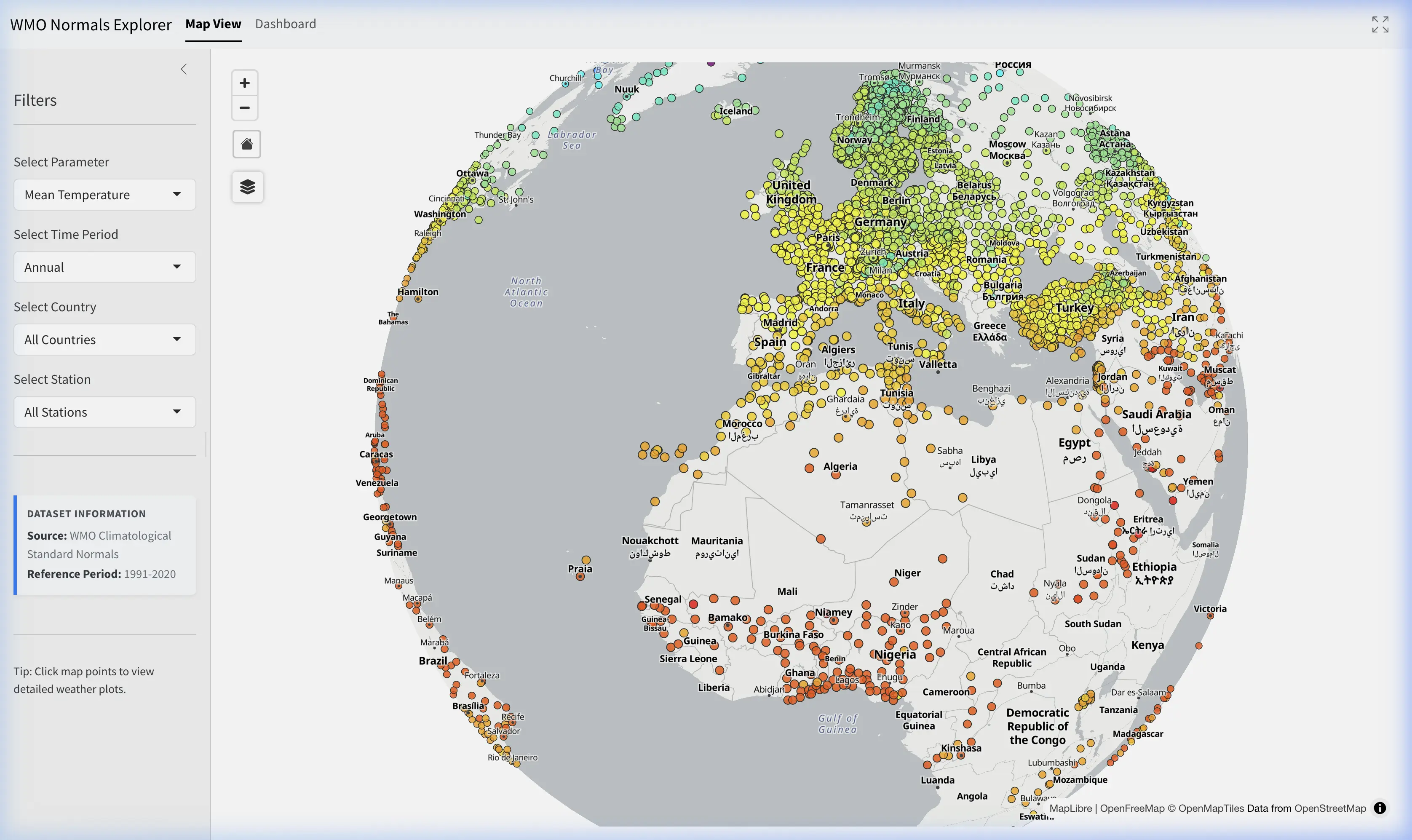
The default view is an interactive WebGL-accelerated map showing all available climate stations matching your filters.
- Colored Dots: Stations are colored dynamically based on the Parameter and Time Period chosen in the sidebar (e.g., darker blue for higher precipitation, red for higher temperatures).
- Selection: Click any dot to select a station. The station will be highlighted with a red ring, and the app will automatically transition to the Dashboard view.
- Layer Control: Use the floating panel on the top-left of the map to switch between OpenFreeMap Positron (light mode), OpenFreeMap Bright (classic), or Sentinel-2 Satellite imagery, and toggle map labels on or off.
Dashboard
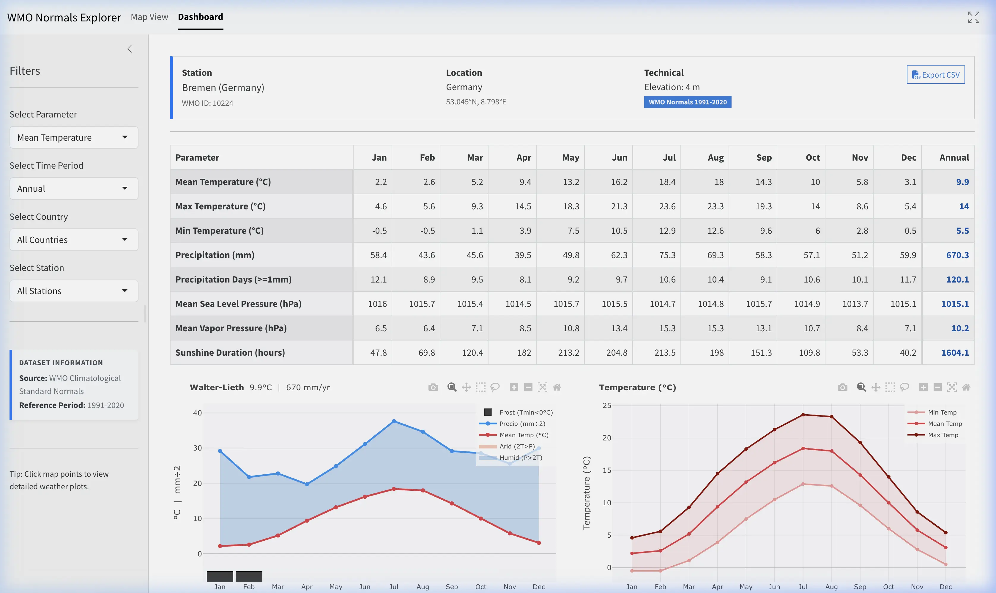
The Dashboard displays the detailed climatological normals matrix for a selected station. It activates only after clicking a station map marker or selecting one from the sidebar dropdown.
Dashboard Header
- Station Info: Displays the Name, Country, WMO ID, and Elevation of the selected station.
- Export CSV: Click the “Export CSV” button to download a spreadsheet containing all calculated 1991-2020 parameters (Annual and Monthly values) for the selected station.
Matrix & Graphs
- Visualizations: Below the matrix, the dashboard dynamically generates interactive charts for all available climatological parameters:
- Walter-Lieth Climate Diagram: A specialized bioclimatic chart showing the relationship between temperature and precipitation throughout the year.
- Red Line: Mean monthly temperature.
- Blue Line: Monthly precipitation (scaled 1:2 against temperature).
- Shading: Blue areas indicate humid periods (Precipitation > 2x Temp); yellow/orange areas indicate arid periods.
- Bars (bottom): Black bars indicate potential frost risk months (Min Temp < 0°C).
- Temperature Curves: Displays seasonal variability with Average Daily Maximum (Dark Red), Mean (Red), and Minimum (Light Red) temperature lines.
- Precipitation: A blue bar chart showing total monthly accumulated rainfall and snowfall in millimeters (mm).
- Precipitation Days (≥ 1mm): Purple bars showing the frequency of significant precipitation events (days per month).
- Sea Level Pressure: A blue line chart showing seasonal variations in mean monthly atmospheric pressure in hectopascals (hPa).
- Vapor Pressure: A green shaded line chart showing absolute humidity trends in hPa.
- Sunshine Duration: Yellow bars showing total monthly sunshine hours.
- Walter-Lieth Climate Diagram: A specialized bioclimatic chart showing the relationship between temperature and precipitation throughout the year.
4. Parameter Definitions
The normals mapped and presented in the dashboard adhere to the following WMO standard definitions:
| Parameter Name | Definition | Unit |
|---|---|---|
| Mean Temperature | Daily mean temperature averaged over the period | °C |
| Max Temperature | Daily maximum temperature averaged over the period | °C |
| Min Temperature | Daily minimum temperature averaged over the period | °C |
| Precipitation | Average monthly or annual accumulated precipitation | mm |
| Precipitation Days | Average number of days per month/year with precipitation \(\ge\) 1.0 mm | days |
| Mean Sea Level Pressure | Average MSLP over the period | hPa |
| Mean Vapor Pressure | Average vapor pressure over the period | hPa |
| Sunshine Duration | Average monthly or annual total hours of sunshine | hours |
5. Official Source and Methodology
These normals are derived directly from the WMO collection of Climatological Standard Normals for 1991–2020, submitted by National Meteorological and Hydrological Services.
Depending on local operational constraints and data gaps, participating nations use standardized WMO guidance (e.g., WMO Guidelines on the calculation of Climate Normals, WMO-No. 1203) to estimate missing values where appropriate and produce high-quality reference data.
For more details on calculation methods, visit the WMO Community Knowledge Hub.