Understanding Long-Term Climate Trends with GHCNm Data
When scientists talk about “global warming,” they rarely point to a single hot day in July. Climate is the long-term average of weather. To understand how the Earth’s climate is changing, researchers rely on massive archives of historical data, specifically looking for long-term trends.
The gold standard for this type of long-term climate analysis is the Global Historical Climatology Network Monthly (GHCNm) dataset, maintained by the National Oceanic and Atmospheric Administration (NOAA) and the National Centers for Environmental Information (NCEI).
With the Climate Explorer GHCNm dashboard, you can independently access this exact dataset to visualize global temperature and precipitation trends across every country in the world.
Why Track Long-Term Trends?
Weather is what happens today; climate is what happens over decades. Tracking monthly values over long periods allows us to identify systematic warming or cooling trends at specific locations.
For example, if the average January temperature in London was generally around 4°C in the 1960s but is consistently closer to 6°C in the 2020s, a linear trend line helps us see that gradual shift amidst the noise of unusually cold or warm individual years.
The Challenge of Station Changes
When analyzing long-term climate trends using absolute temperatures from individual stations, we must account for non-climatic changes over time.
If a mountain weather station relocates 500 meters further down the mountain valley, its absolute temperature readings will suddenly jump higher due to the lower elevation. Is this global warming? No, it’s just a station move.
The Power of the GHCNm Dataset
The GHCNm v4 archive aggregates monthly mean temperature and precipitation statistics from thousands of land-based weather stations worldwide. Some of its records stretch back to the year 1750. Providing raw data from a vast network is valuable, but the true power of GHCNm—and why it is so highly respected in the scientific community—is homogenization.
The Importance of Station Homogenization
Over the course of a century, a single weather station rarely remains perfectly static. Many factors can artificially alter its temperature readings: - Station Relocations: A station might be moved from a city center to a nearby airport. - Instrument Changes: Older liquid-in-glass thermometers might be replaced with modern electronic sensors. - Observation Time Adjustments: The time of day when observers record the daily max/min temperatures might change. - Urbanization: A station originally built in a rural field might gradually be surrounded by asphalt and buildings, causing an artificial warming trend known as the Urban Heat Island effect.
If these artificial shifts are left uncorrected, they can be easily mistaken for genuine climate change, inflating or suppressing the true warming signals.
To solve this, NOAA NCEI applies an advanced data-cleaning protocol known as the Pairwise Homogenization Algorithm (PHA).
How NOAA Cleans the Data
- Detection: The PHA algorithm automatically compares the temperature record of a target station against a network of surrounding “neighbor” stations. By comparing neighboring stations that experience the same regional climate, the algorithm can easily spot sudden, unnatural leaps or drops in the target station’s data that do not appear in the neighboring records.
- Adjustment: Once an artificial shift is detected (like a sudden drop in temperature corresponding to a documented station relocation), the algorithm statistically adjusts the older data to align with the conditions of the modern station setup.
The result of this rigorous, peer-reviewed process is a “cleansed” continuous dataset. When you view the linear trend lines using the GHCNm Explorer, you can be confident that the remaining temperature trends are genuine climate signals, completely stripped of artificial instrumentation noise.
Visualizing Long-Term Trends with Climate Explorer
The GHCNm Explorer removes the technical friction of parsing NOAA’s massive text files. When you click on a station, the dashboard generates interactive time series plots for each month, showing the raw monthly values across the entire station record — often spanning over a century.
Here is how you can use it to track warming trends:
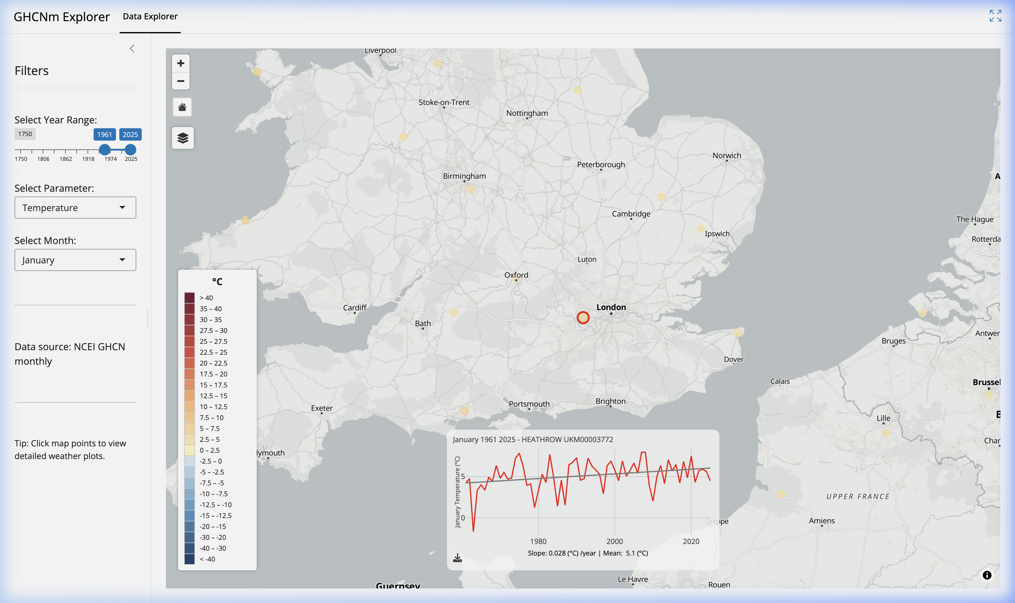
- Select a Global Station: Unlike national datasets (like the DWD or JMA), the GHCNm covers the entire globe. Use the map to navigate to a region of interest, such as the United Kingdom, and click the station dot for London (HEATHROW UKM00003772).
- Filter the Parameters: In the sidebar, set the Year Range to 1961–2025, select Temperature, and look specifically at the January plot to isolated winter warming trends.
- Read the Trend Line: The explorer plots the historical January temperatures (in red) along with a linear trend line (shown in gray). This trend line is fitted using a linear regression model, giving you an immediate visual indication that January temperatures are steadily rising at this location.
- Interpret the Slope and Mean: Below the plot, two key statistics are displayed. For London Heathrow in January, the slope is 0.028 (°C) / year and the long-term mean is 5.1 (°C). The positive slope confirms a definitive winter warming signal. By multiplying the slope (0.028) by the 64-year observation period, we can explicitly show that the average January temperature at Heathrow has warmed by roughly 1.8°C since 1961.
Practical Applications of GHCNm Data
Who actually uses this centuries-old data? While academic climate scientists are the primary users, the cleansed GHCNm dataset provides immense value across several extremely pragmatic sectors:
- Agriculture & Food Security: Agronomists study historical precipitation and temperature trends to determine if traditional crop viability zones are shifting poleward, allowing farmers to proactively adapt by planting more resilient cultivars.
- Urban Planning: City planners analyzing increasing summer temperature trends can advocate for the expansion of urban tree canopies and green infrastructure to combat exacerbating heat waves.
- Insurance & Risk Modeling: Actuaries rely heavily on historical weather volatility and trends (such as increasing extreme precipitation events) to accurately price catastrophe bonds and property insurance premiums in vulnerable regions.
- Energy Infrastructure: As nations transition to renewable energy sources, grid operators use long-term temperature trends from GHCNm to model heating and cooling demand forecasts, optimize energy distribution, and plan infrastructure resilience against shifting climate baselines.
Conclusion
The NOAA GHCNm dataset provides the empirical foundation upon which modern climate science is built. By examining monthly values over century-long records and fitting linear trends, the subtle but profound shifts in our global climate system become undeniably clear.
By making this data explorable to everyone, the Climate Explorer ensures that tracking historical climate patterns is no longer restricted to academic supercomputers—it is accessible to anyone with a web browser.